At Haptik, designing and implementing a Conversational AI solution is the only the start of our journey with our enterprise partners. Our Customer Success Team is constantly at work, optimizing the performance of our solutions to deliver even greater value to all stakeholders.
The following case study will give you insight into how Haptik drives customer success.
Business Goal: Lead Generation
Haptik developed a Lead Generation solution for one of our enterprise partners – a FinTech company that provides peer-to-peer lending services. Our partner offers a variety of loans, including personal loan, education loan etc.
Our objective was to generate as many leads as possible for every category of loan offered, by deploying a Lead Generation bot.
Bot Utility
1. Customer support (answering questions asked by investors & borrowers, thus reducing the volume of queries directed to customer service staff)2. Lead generation (generating leads for every category of loan offered)
Traffic & Bot Placement
1. Monthly active users on partner website is around 10,000 (as per Similarweb). 2. The bot was placed on all pages of the partner website.
3. Users did not need to log in to engage with the bot.
4. Bot prompts were not enabled.
Details collected from users
1. Name
2. Email-Id
3. Mobile number
4. Residential city
The Problem
Our enterprise partner was facing the following issues:
1. The incoming traffic on the bot was low.2. There was a high number of drop-offs at various stages of the chat flow.
Both these issues cumulatively resulted in a low number of leads, as well as dissatisfied end users.
Our Solution
The following steps were taken by Haptik’s Customer Success Team in order to optimize the bot’s performance:
1. Task-box reordering
The task-box contained 7 tasks. We monitored the usage of tasks and re-ordered them based on the combination of usage, utility & importance of the task. For e.g. “Get in touch” is a task which is moderately used but is a source of leads.
The added benefit was that people were more likely to tap when they found their task present right in front of them, rather than having to actively look for it in the task box, thus increasing usage.
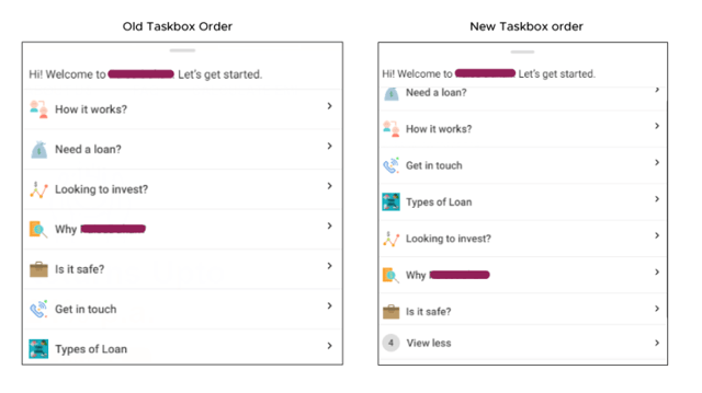
“Need a loan” & “Get in touch” were the lead generation tasks, and the rest of the tasks were engagement driven. This had a major impact on usage of the bot, and the number of leads generated.
2. UI Changes
We took another look at the UI and identified areas of improvement. We updated the thumbnails and images to not only look more visually appealing, but also be in sync with the look and feel of the parent website. A special emphasis was placed on making all the icons and CTAs look more ‘tappable’. 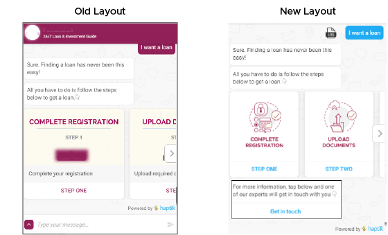
a. The images were changed in the carousels, as earlier images were looking almost the same for all steps.
b. Users were now able to see 2 steps on a single screen, which increased the chances of users going ahead in the flow, as compared to earlier where they could view only 1 CTA.
This helped with decreasing the drop off at key levels in the flow, and was also more in sync with the website design.
3. Follow up messages & re-ordering UI elements
Follow up messages are messages that are sent to users after a time lag to prevent them from dropping off, while giving them the ability to come back to the bot to complete the task. An optimum time lag has to be maintained for follow-up so that it doesn’t conflict or interfere with the flow of the task and user experience.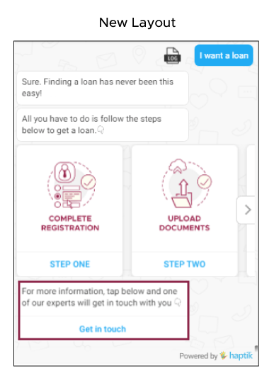
In the above example, we added “Get in touch” as a follow-up message so that even if the user didn’t go ahead in the flow earlier because of various reasons, they could still come back and use this feature to connect with the concerned team. The time lag was set to 20 seconds.
4. Relevant CTA’s
Since our solution was a lead generation bot, it made sense to liberally add appropriate CTAs so that users were not restricted in their options and more likely to give their details. For instance, in the most used loan tasks, we added the “Get in touch” CTA as well.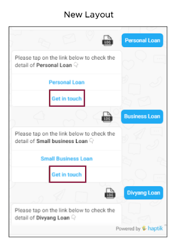
‘Get in Touch’ CTA added to most used loan tasks
We added the most used and relevant CTA’s throughout the flow to increase the chances of people tapping on them. For this, historic data was used to check the usage of all the tasks, with the most high-usage tasks being prioritized.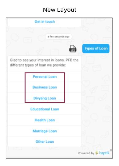
Data Validation
After making all the aforementioned changes, we measured the impact of our modifications for almost 2 weeks, and observed significant growth in almost all bot performance metrics.
The charts below display the month on month comparison of bot performance before and after the changes were implemented: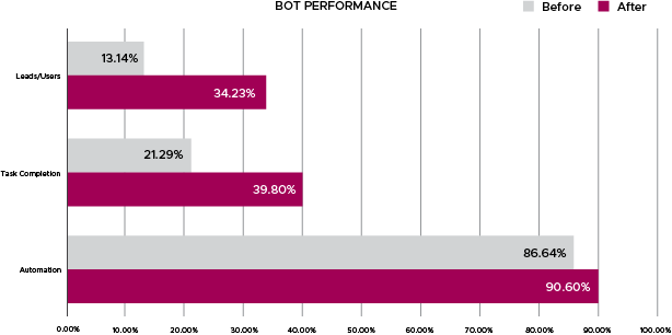
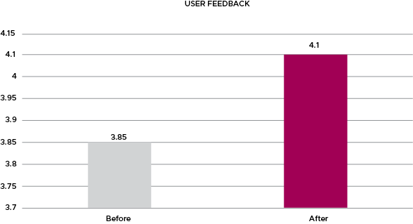
1. Bot usage doubled in the second month due to the following reasons –
b. A campaign executed by our enterprise partner in the 1st week of the month following implementation of our changes.

2. The most important and significant change was the increase in lead conversion, which grew by almost 161%. This meant that all the changes we made with regards to UI elements, follow-up messages, and adding more CTA to give more options to the users, worked in the right direction.
3. Task completion almost doubled. This was directly correlated to the fact that users were generating more leads, as the flow was better and more in sync with what the users were looking for.
4. The User feedback also reflected the enhanced user experience, as it had gone up from an average of 3.85 to 4.10
5. Average number of user interactions per conversation had gone up from 3.60 to 3.95, which signified that users were now finding the bot more engaging.
6. Drop off per task reduced. This meant that a greater number of people were actually going deeper into the flow, in turn increasing conversion and engagement. 
Drop off per task before and after implementation of changes
Key Insights
The following key insights emerged from our study of the Customer Success Team’s bot optimization efforts:
1. It is imperative to have the task order designed as per the usage. Most users should get what they were looking for in the first look.2. Bot design, colors and elementsshould always be in sync with the native website.
3. The CTA’s should be aligned with the goal of the bot. It gives users more flexibility and significantly increases the probability of task completion.
4. Follow up messages should be used. These help with bringing the user back to the conversation and continue the flow, thus reducing drop offs. Users are less likely to feel lost in this case.
In Lead generation campaigns, one should always aim to build a trust factor – since the goal is to trigger monetary action on the part of the user. This can be done by effectively demonstrating the scale at which customer is operating, or certifications/awards that highlight the credibility of the customer.








.jpg?quality=low&width=352&name=blog-banner-2%20(1).jpg)



.png?quality=low&width=352&name=Untitled%20design%20(31).png)




-1.png?width=352&name=BlogHeader2%20(3)-1.png)

.png?width=352&name=image%20(18).png)
-2.png?quality=low&width=352&name=image%20(11)-2.png)


-1.jpg?width=352&name=Linkedin+%20Twitter%20(1)-1.jpg)


-1.png?width=352&name=LinkedIn%20(1)-1.png)
.png?quality=low&width=352&name=LinkedIn%20(3).png)




.jpg?width=352&name=sentiment%20(1).jpg)










source on Google