
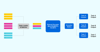
 AI Agent
In my previous article, I covered the basics of Vector Drawables and how to animate a few of their attributes using Animator Vector Drawables. Assuming you are through with that, in this article, we will walk through examples involving techniques that can be used to have a nice little icon animation in your app.
Path-Morphing
As the name suggests, this involves morphing from one path to another which is achieved by animating android:pathData, attribute of the <path> elements of any <vector>.
In order to morph path A into path B, we need to take care of these first:
- A and B must have the same number of drawing commands.
- The ith drawing command in A must have the same type as the ith drawing command in B, for all i.
Say, if path A has M12,13 as its 4th drawing command. Path B must have a similar M<?><?> as its 4th drawing command for Path A to able to morph into path B. Android animates the difference between the values assigned to these matching commands only.
Let’s say, we need to have a play vector drawable which morphs into a pause vector drawable when tapped and back to play when tapped again:
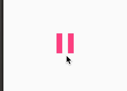
To provide one such drawable to an ImageView to do all that, we use AnimatedStateListDrawable. So, let’s have a look at as_playpause.xml.
<itemandroid:id="@+id/pause"android:drawable="@drawable/vd_pause"<strong class="markup--strong markup--pre-strong">android:state_selected="false"</strong> /> |
| .... .... .... |
<transitionandroid:drawable="@drawable/avd_play_to_pause"<strong class="markup--strong markup--pre-strong">android:fromId="@id/play"</strong>android:reversible="false"<strong class="markup--strong markup--pre-strong">android:toId="@id/pause"</strong> /> |
- 1. The <item> element decides the vector drawable which will be used when the ImageView is in a given state. In this example, I have used android:state_selected to decide between the state changes. Obviously, one can provide a custom state through <declare-styleable> but I won’t go into those details here.
- 2. The <transition> element decides which Animated Vector Drawable to run when ImageView changes from one state, decided by android:fromId tag, to another, decided by android:toId tag. One key point to keep in mind here is that each <transition> element’s <animated-vector> drawable uses android:drawable attribute to decide the drawable that will be used to run the animation on when that transition is applied.
Now, have a look at the avd_play_to_pause.xml we have here, which is the Animated Drawable that runs when ImageView changes from play to pause state:
<?xml version="1.0" encoding="utf-8"?><animated-vector xmlns:android="http://schemas.android.com/apk/res/android"xmlns:tools="http://schemas.android.com/tools"android:drawable="@drawable/vd_pause"tools:targetApi="lollipop"><targetandroid:name="iconPath"android:animation="@animator/morph_play_to_pause" /></animated-vector> |
The ObjectAnimator, assigned through android:animation, is as follows:
<objectAnimator xmlns:android="http://schemas.android.com/apk/res/android"android:duration="600"android:interpolator="@android:interpolator/linear"android:propertyName="pathData"android:valueFrom="@string/path_data_play"android:valueTo="@string/pause_path_data"android:valueType="pathType" /> |
- android:propertyName indicates that it is the pathData property that we are interested in animating.
- android:valueFrom is used to assign the pathData to morph from and and android:valueTo is used to decide which pathData to morph to.
Since these values are path-commands, we also have to specify the android:valueType, which is “pathType” for pathData values.
And that completes this discussion. Now, let’s move on to the next technique.
Path Trimming
The android:trimPathStart and android:trimPathEnd path–attributes of a vector drawable can be used to decide the sections of the path data to render on UI. As with many of the other path-attributes, these can be animated as well using Animated Vector Drawable.
- android:trimPathStart controls the start of the visible part, which has a default value of 0.
- android:trimPathEnd controls the end of the visible part, which has a default value of 1.
In the example below, the heart icon is filled when tapped and it reverts back to the empty state when tapped again:
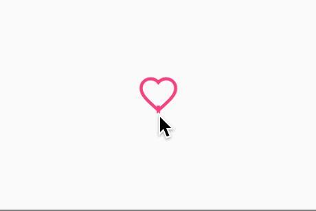
Icon Animation achieved through Path Trimming
I used AnimatedStateListDrawable API again to provide the ImageView a drawable that could do this job. Have a look at as_like_unlike.xml
<?xml version="1.0" encoding="utf-8"?><animated-selector xmlns:android="http://schemas.android.com/apk/res/android"xmlns:tools="http://schemas.android.com/tools"tools:targetApi="lollipop"><itemandroid:id="@+id/liked"android:drawable="@drawable/vd_like"android:state_selected="true" /><itemandroid:id="@+id/not_liked"android:drawable="@drawable/vd_like"android:state_selected="false" /> |
<?xml version="1.0" encoding="utf-8"?><animated-selector xmlns:android="http://schemas.android.com/apk/res/android"xmlns:tools="http://schemas.android.com/tools"tools:targetApi="lollipop"><itemandroid:id="@+id/liked"android:drawable="@drawable/vd_like"android:state_selected="true" /><itemandroid:id="@+id/not_liked"android:drawable="@drawable/vd_like"android:state_selected="false" /> |
It has two <item> elements for both the states. If you notice, I have used the same vector drawable in both the states out of ignorance. It works fine for the purposes of demonstration, but in real scenarios, one might want to be in a different state by default and thus it would be wise to have different drawable for each state. And then there is one <transition> element which takes care of the transition between these states:
<transitionandroid:drawable="@drawable/avd_unliked_to_liked"android:fromId="@id/not_liked"android:reversible="true"android:toId="@id/liked" /> |
The attribute android:reversible helps Android run the same animation in reversed order when the ImageView instead changes from @id/liked to @id/not_liked.
Everything else is almost the same as is in the example explaining path-morphing, except for our ObjectAnimator for obvious reasons. Let’s have a look at fill_like.xml, the animator being used here:
<objectAnimator xmlns:android="http://schemas.android.com/apk/res/android"android:duration="300"android:interpolator="@android:interpolator/accelerate_decelerate"android:propertyName="trimPathStart"android:valueFrom="1"android:valueTo="0"android:valueType="floatType" /> |
The android:propertyName=”trimPathStart” identifies that this animator is interested in animating the attribute “trimPathStart”. Of course, one can try other animating properties like trimPathEnd or/and trimPathOffset and go crazy with their imaginations.
You can check out the complete source code and start playing around if haven’t already. #BuildBetterApps
Also, don’t forget, we are hiring high-quality engineers. So if you are interested reach out to us at hello@haptik.ai.